So what are we waiting for? Let’s take a look at the new changes!
Social Hub Improvements
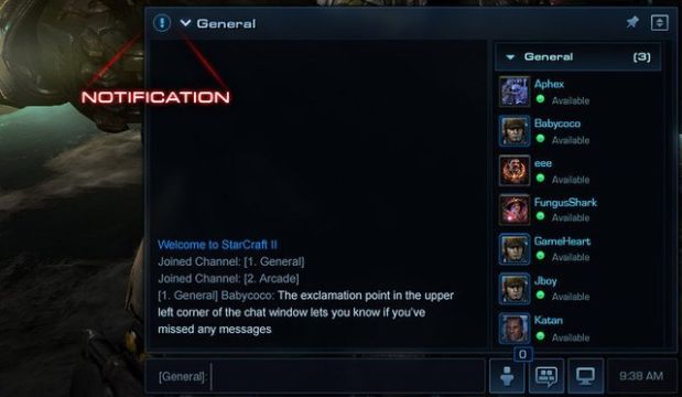
One of the main concerns of the Starcraft II community was the lack of social interaction in the game. With games like DotA 2 picking up new community friendly UIs, the devs have now looked at making the chat box part of the everyday user’s life. As such, all chat functions have now been combined into one space that will take up the right-hand side of the screen. It can be adjusted to take up more or less space at the user’s discretion, and can be used for private or channel chat rooms. The window can also be pinned so that it will remain on the screen, even while not actively typing.
Other improvements include: text color changes to separate user names from messages, timestamps, new hotkeys and slash commands, as well as group and clan chat functionality.
Campaign, Multiplayer, and Arcade UI Overhauls
Remember how great the Starcraft: Brood War menu (above) looked? Remember how each hero from that episode’s story acted as the option to begin this or that campaign?
Remember how it actually looked like the developers put some bloody effort into how the game looked outside of the actual gameplay? Well, guess what…?
They brought it back!
That’s right Brood War fans, the original Starcraft: Brood War campaign menu is back, and looks better than ever! The menu doesn’t have the little details like seeing Kerrigan’s modified tissue or Raynor’s current health, but it’s a grand improvement over the crummy little image boxes we’ve had for the last two years!
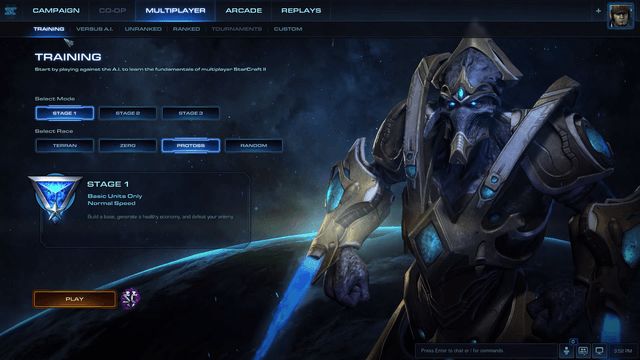
Before you start shedding tears of joy, however, you should also know that the multiplayer menu has received a similar overhaul. No longer will we suffer under static 2D splash arts. Instead, we have this!
Beautiful fully animated 3D backgrounds! A dream come true!
Depending on the race that the player has selected, the background will swap between a Zealot, Marine, or Hydralisk. Each one has its own neat little animation, and it just makes the game feel like it should have from the beginning. Why Blizzard didn’t have it this way in the first place is a mystery, but I’m sure glad the developers have changed it now.
Oh yeah… and for those who care, the Arcade screen has been updated.
These are just the highlights of the changes to the UI the Starcraft II team has made to Legacy of the Void. For more information, you can watch the official YouTube video below for a detailed explanation of the new UI features.
With each new update, Starcraft II: Legacy of the Void seems to be gathering more and more hype. The game is starting to really feel like it will be bringing as much content as Wings of Liberty did back in 2010 - a really refreshing gesture since Heart of the Swarm was a bit lackluster.
It’s going to be bittersweet seeing this game released in such a polished state. While it will be a big bang for the final installment to the Starcraft II series, I’m going to be sad to know that this will be the last Starcraft game.. at least for a while.
What do you guys think of the new UI improvements? Any particular highlights that draw in your attention? Are you ready for Legacy of the Void? Leave your opinions in the comments section below!


